Page 43 - The Constructor 2017
P. 43
The City of London


       the finest quality materials and the many friends who have undertaken a myriad of tasks – both
       sewing and non-sewing related, cutting intricate shapes, teaching her new techniques and, of
       course, making endless cups of coffee.  Most of all, Vivienne would like to thank everyone for their
       huge amount of interest and encouragement.  Vivienne also thanked her many friends from Core
       Arts, a wonderful arts charity for people with mental health problems, who, she says, got her
       through a very difficult period and helped her to regain her creativity and gave her back the
       confidence to undertake the work.
       The symbols on the Altar front all relate to St Lawrence.
       The Frontal was sponsored by several Livery Companies, and the crests of the companies that
       donated (including, among others, the Worshipful Company of Constructors) are embroidered on the
       reverse of the Frontal together with the names of three individual sponsors.  In the centre is the
       crest of the City of London, which is particularly appropriate as St Lawrence Jewry is designated as
       the official church of the City of London Corporation.
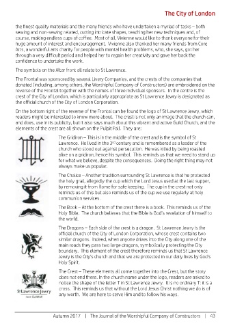
       On the bottom right of the reverse of the Frontal can be found the logo of St Lawrence Jewry, which
       readers might be interested to know more about.  The crest is not only an image that the church can,
       and does, use in its publicity, but it also says much about this vibrant and active Guild Church, and the
       elements of the crest are all shown on the Pulpit Fall.  They are:
                      The Gridiron – This is in the middle of the crest and is the symbol of St
                                          rd
                      Lawrence.  He lived in the 3  century and is remembered as a leader of the
                      church who stood out against persecution.  He was killed by being roasted
                      alive on a gridiron, hence his symbol.  This reminds us that we need to stand up
                      for what we believe, despite the consequences.  Doing the right thing may not
                      always make us popular.
                      The Chalice – Another tradition surrounding St Lawrence is that he protected
                      the holy grail, allegedly the cup which the Lord Jesus used at the last supper,
                      by removing it from Rome for safe keeping.  The cup in the crest not only
                      reminds us of this but also reminds us of the cup we use regularly at holy
                      communion services.
                      The Book – At the bottom of the crest there is a book.  This reminds us of the
                      Holy Bible.  The church believes that the Bible is God’s revelation of himself to
                      the world.
                      The Dragons – Each side of the crest is a dragon.  St Lawrence Jewry is the
                      official church of the City of London Corporation, whose crest contains two
                      similar dragons.  Indeed, when anyone drives into the City along one of the
                      main roads they pass two large dragons, symbolically protecting the City
                      boundary.  This element of the crest therefore reminds us that St Lawrence
                      Jewry is the City’s church and that we are protected in our daily lives by God’s
                      Holy Spirit.
                      The Crest – These elements all come together into the Crest, but the story
                      does not end there. In the church name under the logo, readers are asked to
                      notice the shape of the letter T in St Lawrence Jewry.  It is no ordinary T: it is a
                      cross.  This reminds us that without the Lord Jesus Christ nothing we do is of
                      any worth.  We are here to serve Him and to follow his ways.


                    Autumn 2017    |    The Journal of the Worshipful Company of Constructors    |    43

